2023/24
Inhouse studio
Arts, Tourism
Lead UXUI designer

The existing website no longer reflected MONA’s evolving identity or the full breadth of its brands and experiences.
Our goals were to:
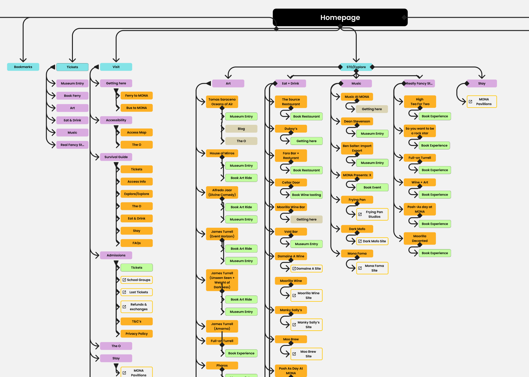
1. Redefine the information architecture: Create a structure that clearly presents MONA’s diverse offerings, while making essential information easy to find.
2. Simplify the booking flow: Encourage users to discover, interact with, and seamlessly book their MONA experience—including a combined museum entry and ferry booking flow that reduces friction and improves conversion.
3. Add edge and mystery: Inject just enough intrigue to spark curiosity—without leaving users lost in the maze.
4. Craft a bold visual identity: Design a unique and unmistakably MONA digital experience that feels as provocative, playful, and unexpected as the museum itself.

- Stakeholder interviews across marketing and visitor experience teams
- Guerrilla research with museum visitors
- Hotjar and Google Analytics analysis
- Competitor analysis
- Most visitors booked museum entry and ferry transport
- Visitors were unaware of MONA’s broader experiences
- Mobile was the dominant device for planning visits

Location
Location

This research revealed an opportunity to simplify the visitor journey by integrating transport and museum tickets into a single booking flow while better surfacing MONA’s wider cultural offering.
1. Simplify the visitor journey
Combine ferry and museum bookings into a single flow.
2. Encourage exploration
Expose exhibitions, dining and events earlier in the planning process.
3. Reflect MONA’s identity
Create a digital experience that mirrors the museum’s provocative and mysterious brand.

MONA was designed to be entered via a ferry that picks passengers from the Hobart port. The challenge was that museum entry and ferry transport follow different pricing rules. But the outcome resulted in more efficient experience for the user and the business benefit was increased ferry purchases.
The old site had a seperate booking site for all the bookable experiences. The new site all bookings were integrated on the main site.

Research showed visitors often missed additional experiences; integrating up-sell options increased engagement and potential revenue.

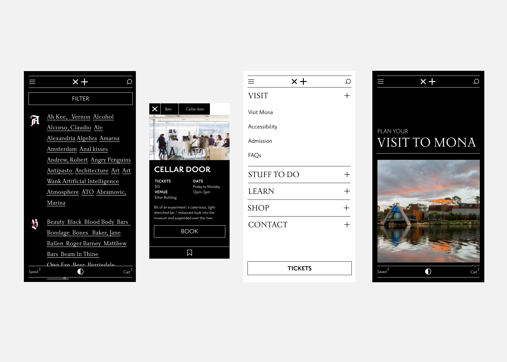
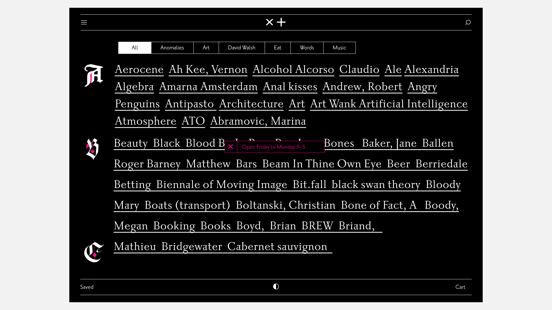
MONA was designed to be explored—as a space of wonder and experiment. The concept for the home page is index. Its intended to be playful and explorative like the museum is.
The homepage index was designed to surface experiences through a discovery-driven browsing model.
The homepage uses an “index” structure inspired by early printed catalogues and the Gutenberg Bible . This allows MONA to present art, experiences, and inside jokes in a non-linear way that reflects the museum’s playful and exploratory identity.
The typography cleverly blends serif and sans-serif fonts, juxtaposing the old and new. To add a final touch, the design includes rotating GIFs of pornographic blackletter typefaces. For a closer look, explore the MONA Index in action and get lost in its whimsical rabbit hole.
Location
Location
Art Curation is at the heart of MONA, to pay homage, intended the images of the artworks to sit in a stack the way curators in the past might have sifted through a stack of polaroides or prints.

Location

Location
The saved feature allows the user to self curate a day at MONA, add a note and share it with travel companions. All without the stress of adding to cart with a timer ticking.

Location

Location

Location

Location

Location

Location


• Post‑launch research showed a 30% higher completion rate in the new booking flow
• Simplified booking journey and increased ferry bookings by 35%
• Increase in upsell experiences by 25%
• increased visibility of exhibitions and events
Location
Location

