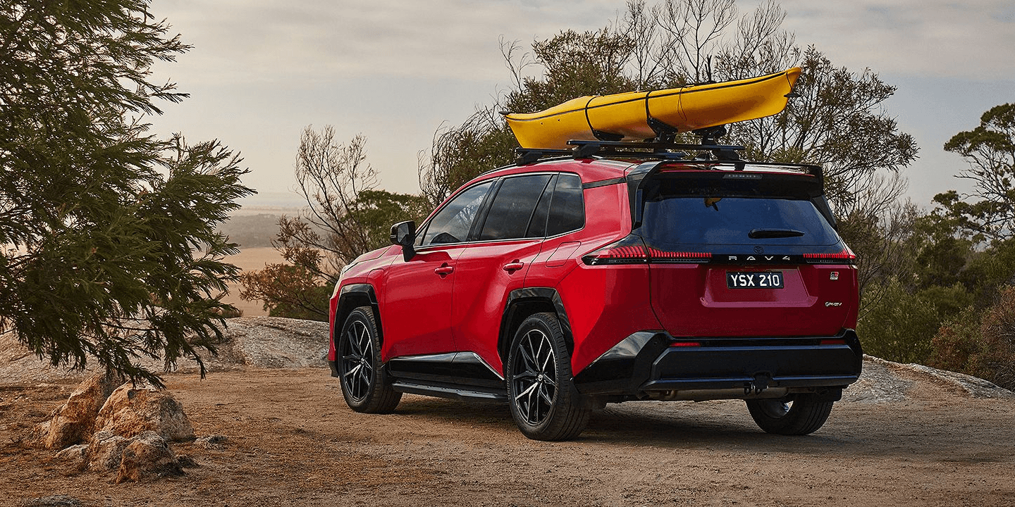
Designing digital experiences at scale for Toyota Australia.
At R/GA, I worked across Toyota Australia's digital ecosystem, designing product journeys, finance experiences and campaign interfaces within an evolving design system. My role combined detailed UI craft with system thinking, helping translate defined customer journeys into accessible, production-ready experiences.

Toyota Help me choose tool
My role
I worked as Senior Product Designer on Toyota.com.au, leading interaction and UI design for high-traffic journeys including the Help Me Choose finance finder and Electrified Hub. My role was to translate complex journey requirements into clear, responsive interfaces, define reusable interaction patterns where Toyota's existing system didn't cover the use case, and maintain consistency and accessibility across multiple product teams working within the same ecosystem.
I took defined journey requirements through interaction design, system extension, high-fidelity UI and implementation.
Working with project managers, creative directors and developers across multiple product teams.
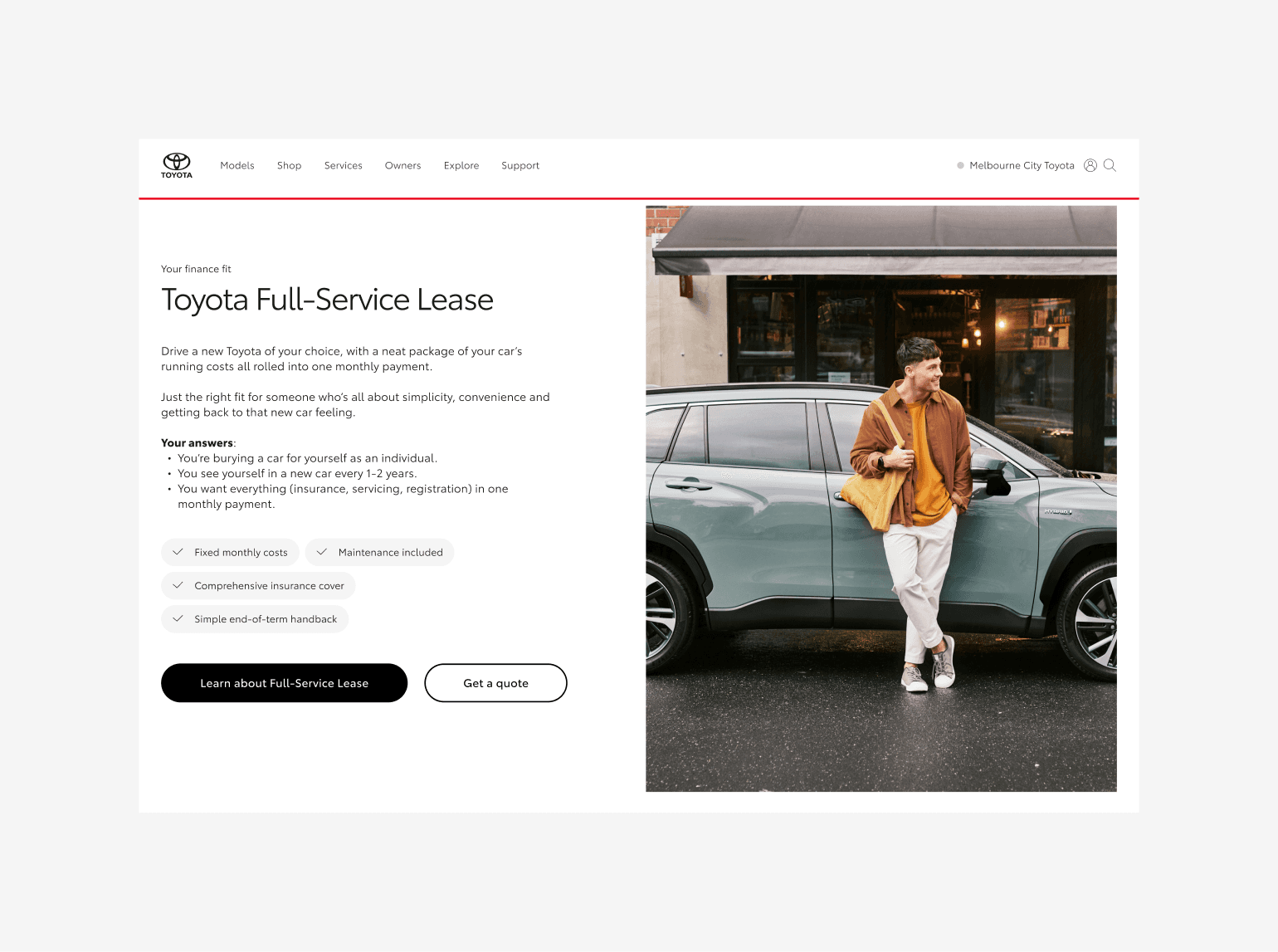
Toyota Help me choose tool
What We Learned
The quiz brief covered a huge range of financial topics, question types, states and outcomes, and it needed to plug into a design system that other teams were shipping against in parallel. Early on, three things shaped how I approached it: the complexity needed to be absorbed by the interface, not passed on to the customer; one system had to hold up across finance, EV and campaign work without fragmenting; and a lot of the visual load would come from Toyota's existing brand imagery, not new photography, so curation mattered as much as layout.
That reframed the brief from designing a quiz to building a pattern that any future quiz, in any product team, could be assembled from.
What I Discovered
01 — Complexity had to be absorbed, not exposed A wide range of financial topics still had to feel like one simple decision to the customer.
02 — One system, many teams Toyota's design system was being extended by multiple product teams at once, so nothing I built could be a one-off.
03 — The imagery already existed Hero content came from Toyota's brand library, which meant the job was curating for accessibility and cohesion, not commissioning new visuals.
At the end of the quiz, users receive personalised financial recommendations. These screens needed to do three things clearly: show the recommended option, provide supporting context, and prompt the next action. Using card layouts and strong visual hierarchy, I designed result screens that allow users to quickly scan and understand their options without feeling overwhelmed.


Designing the Quiz Interface
Design Decisions
01 — One question, one decision
Rather than exposing multiple financial inputs or decisions on a single screen, each step focused on one task. This increased the number of steps in the flow, but reduced the amount of information customers had to interpret at once.
Trade-off: a slightly longer journey in exchange for lower cognitive load.
02 — Extend patterns, not individual screens
The range of questions initially suggested several bespoke layouts. Instead, I reduced them to four reusable question types that could accommodate different content without introducing a new pattern for every finance topic.
Trade-off: less freedom at individual screen level, but much greater consistency and scalability.
03 — Keep recommendations visually restrained
The result had to communicate a personalised finance recommendation without making it feel like another dense financial product page. I used a card-based hierarchy that separated the recommendation, supporting information and next action.
Trade-off: prioritising comprehension over exposing every available detail immediately.
UI & Interaction Decisions
Consistent question patterns: reduced many content variations into a small number of reusable UI treatments.
Clear state feedback: defined selected, validation, loading and error behaviour so users always knew what had happened.
System-first implementation: reused Toyota components wherever possible and only extended the system when existing patterns could not support the required behaviour.
Responsive hierarchy: preserved clarity and emphasis across desktop and mobile without creating separate visual languages.


I defined the UI states and behaviours needed to turn the UX flows into a consistent, accessible and reusable quiz interface.
Working Within the System
Toyota's design system existed before this project started and wasn't something I could deviate from. The typography, colour and core components were already established across multiple product teams, and none of that was up for debate. The real challenge wasn't choosing an approach, it was fitting a quiz with this many question types, states and outcomes inside that system without stretching it somewhere it wasn't built to go.
The system covered the basics, but not a multi-step decision flow like this. Every pattern built to extend it, covered under Design Decisions, had to inherit the existing design language rather than introduce a new one, so new financial topics could be slotted into the quiz as they came up without a new visual language signed off every time.
The Quiz Interface
The finished quiz walks each customer through one focused question at a time, drawing on Toyota's existing brand imagery throughout, and closes with a personalised finance recommendation that stays as easy to read as the questions that led to it.

Ohh what a feeling
Campaign Moments
Loading states are an easy thing to overlook, but they're also one of the few moments in a finance flow where brand can show up without slowing the customer down. The "Ohh what a feeling" loading animation used that pause to inject some of Toyota's personality into an otherwise functional screen.
Outside the quiz, I also designed a homepage takeover for the Toyota Go rewards platform, built from modular components to showcase partner promotions and seasonal offers without needing a one-off build each time.

This was a fixed-term contract that concluded before longer-term performance data was available, What shipped:
Live in production on toyota.com.au, a scalable quiz interface handling a large number of financial topics and question types without breaking pattern.
Reusable components built to extend cleanly as Toyota's product teams add new topics, rather than needing new screen-level design work each time.
Consistent, accessible execution across a design system shared with multiple concurrent product teams.