2025
R/GA
Automotive, Finance
Senior Product Designer
Toyota's design system provided the foundation — typography, colour, and core UI components. Working within this system, I designed a set of reusable quiz patterns covering question layouts, answer card components, form inputs, progress indicators, navigation controls, and result cards. This approach meant new screens could be built quickly and consistently, without reinventing the wheel for each variation.

Location
Location

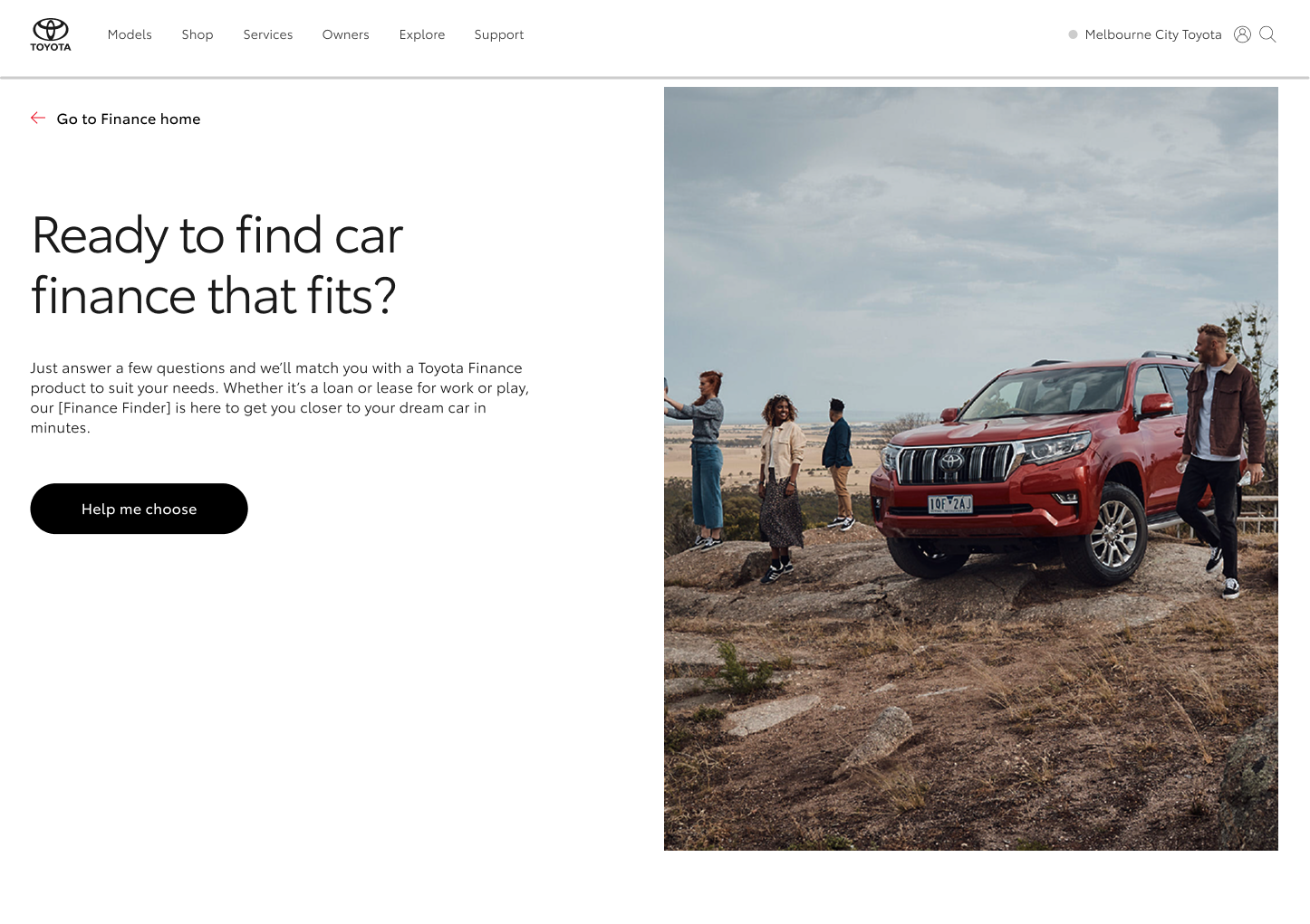
The quiz required four main question formats: single choice, multiple choice, informational screens, and financial input questions. To support this range, I designed flexible layouts built on consistent spacing, typography hierarchy, and card patterns. The goal was the same across every format — make a financial question feel as simple as possible to answer.
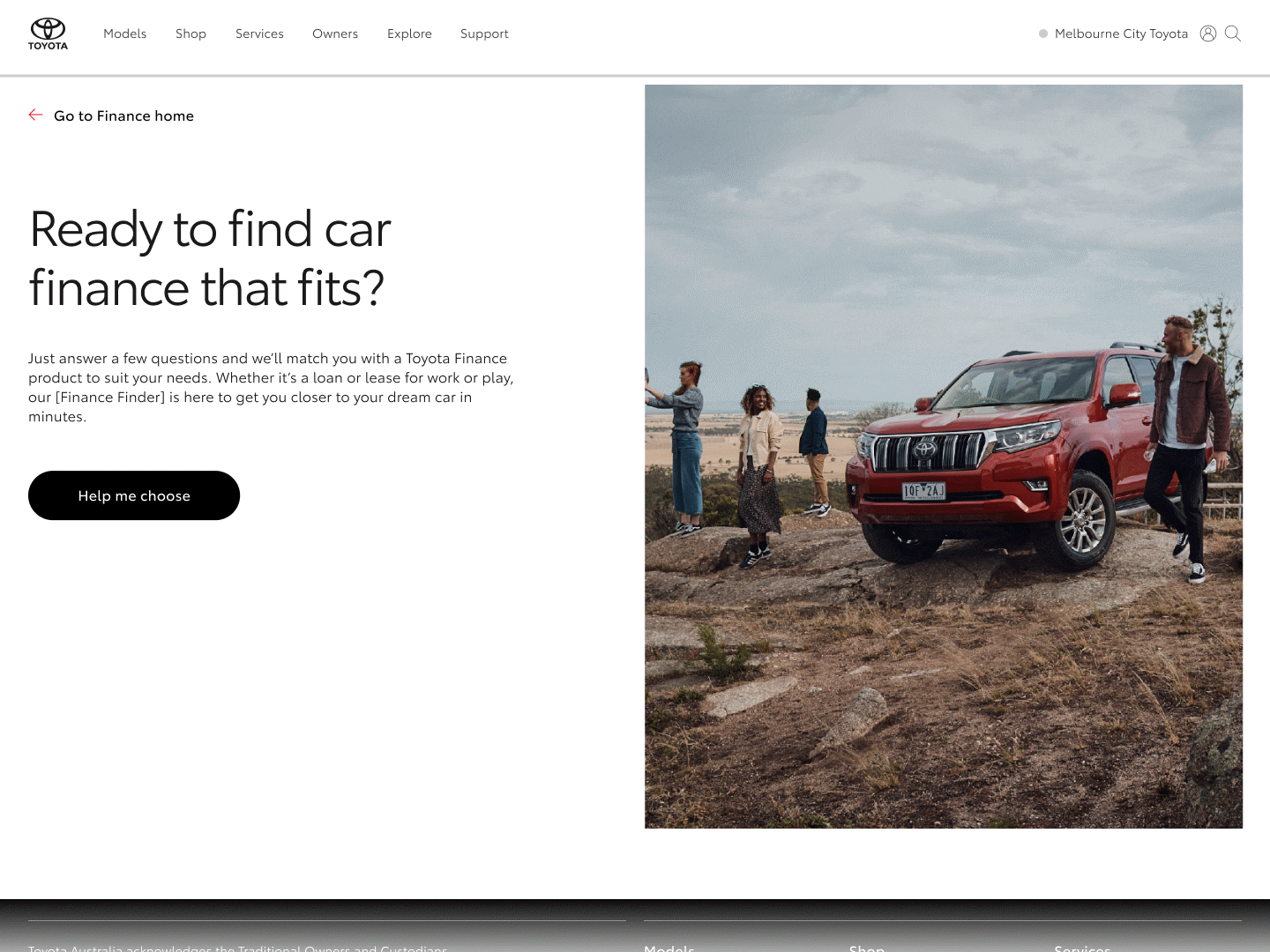
Hero images played an important role across the experience, appearing at the start of the quiz, throughout question screens, and on result and recommendation screens. Images were selected from Toyota's existing brand library, with careful consideration given to how each image reinforced the tone and context of the screen it supported. Selections needed to reflect the financial subject matter of each moment in the quiz, align with Toyota's brand aesthetic, and hold up against accessibility requirements — particularly around contrast when text was placed over or alongside imagery. The result was a visual layer that felt cohesive and considered throughout the full experience, rather than decorative as an afterthought.
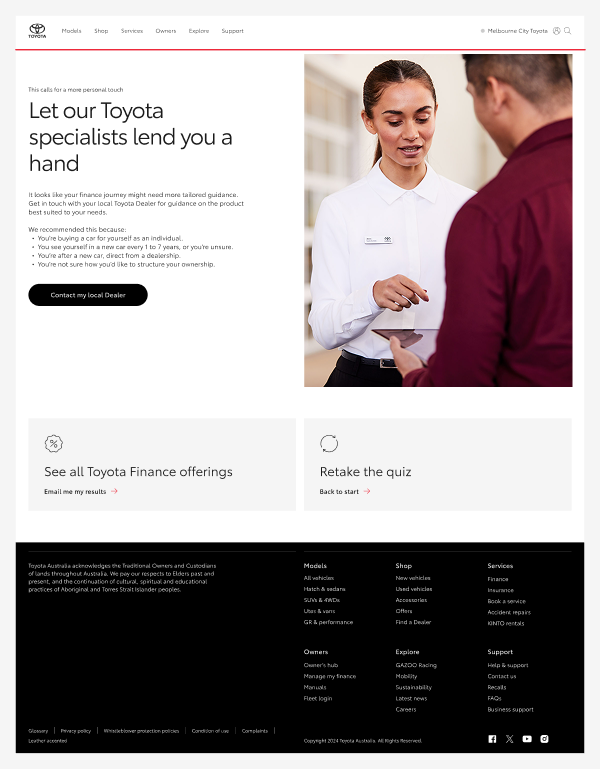
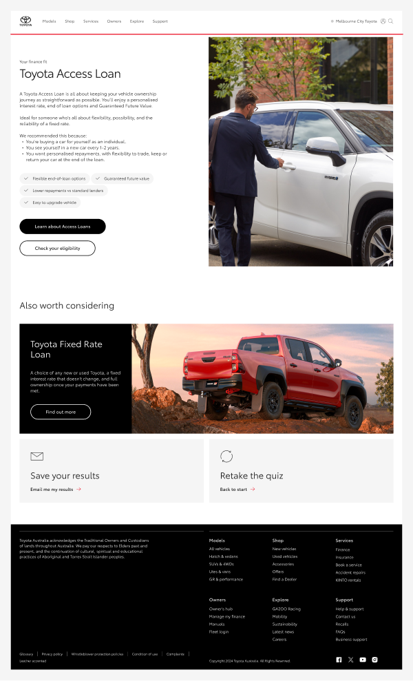
At the end of the quiz, users receive personalised financial recommendations. These screens needed to do three things clearly: show the recommended option, provide supporting context, and prompt the next action. Using card layouts and strong visual hierarchy, I designed result screens that allow users to quickly scan and understand their options without feeling overwhelmed.
Location
Location
The final design delivered a scalable interface supporting a large number of quiz screens with consistent visual execution. By leveraging the design system throughout, the UI stayed consistent across the full experience, new question variations could be designed rapidly, and developer handoff was clean and straightforward. The project is a good example of how a well-applied design system can bring structure and speed to a complex interface problem.
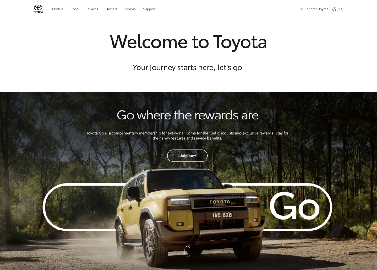
I designed a homepage takeover for the Toyota Go rewards platform to showcase partner promotions and seasonal offers. The layout was created to maximise visibility while remaining consistent with Toyota’s design system and brand, using modular components that allow campaigns to be easily updated without disrupting the overall experience.